Window Dressing: The Art Of Adorning The Eyes
“Eye on Design” Archive from Mann Report (Article By Gail Green)

As windows are the eyes of the home and are a major focal point of any room, it is only fitting they deserve special treatment. And, yet, the modern impulse to forget or play down their dressing is omnipresent. It appears that when there is a “view,” the decorative framing aspect of that vista is dismissed. Instead of enhancing the attractive outside perspective, dressing the window has oftentimes become a forgotten art.
There is nothing wrong with plain, especially when the views are spectacular. But, when a room can be immeasurably improved upon, when the view can be amplified, it begs the question: why not? The misconception, here, is that window coverings somehow preclude or obviate the view, that one square inch of air will be missed. That perspective is putting your nose too close to the pane and not seeing the advantages in the round. That is, by framing the view, by making it a focal point, the vista is actually enhanced.
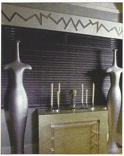
Sometimes, the addition of a simple header is all that is needed to frame a view. In many ways, this is comparable to a painting not having a frame. And, though it is not uncommon for many modern paintings to prefer that look, the wall itself acts as the work’s frame. With a window, however, the relationship of view to wall is not that clean. There are beams and columns that interfere with a clean background of window to wall. Window dressing helps that transition by acting as a mediator, softening the hard edges.
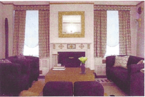
What is particularly interesting is how subtle this transition from wall to view can be. Window dressing, itself, can be a simple overhang of side panels upon window frame. One can even decoratively increase the size of the window. While the literal size of the window can’t be increased, the illusion of an increase in size may be affected by simple visual tricks. For instance, if your window is 3 feet wide and you want to make it look larger, create a valance, hard or soft, that extends at lease 6” past on either side, thereby making the header 4 feet plus. By then adding side panels that start at the extended width, say at least 6 inches out, on each side, the visual illusion is that of a window 4 feet wide. In this particular instance, the view is especially highlighted, while overlapping the window itself by only one or two inches. Thus, the vista is amplified, rather than obviated. This technique is especially helpful in rooms where the window is the only focal point.
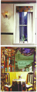
Window dressing can add a decorative levity to a room. The draperies can metaphorically take its theme from the other elements in the room. For instance, if there is a particular pattern that needs accentuated, the window treatments can encapsulate that theme into its design. So, if you have a fabric motif of, say, circles and swirls, that design may be reiterated in the header, side panels, or shades. Alternatively, if you want to create some levity or clever humor to a space, the header can express this aspect. For instance, if the theme is nautical, the window dressing can be a simple pole over the window frame from which a simple shade may be extended, very like that found on an ocean liner over portholes. By adorning the windows, the eyes of the room, a room is enhanced and enlightened. The clever use of draperies improve the overall appearance of a space, creating a focal point and highlighting the views.


*Note – Article adapted from print. Images reflect reduced quality.
Click here to view original print article.
____
Like this post?
Subscribe to our newsletter for more design tips, tricks and insights!

