Where East Meets West: The “Flow” Of Floor Plans
“Eye on Design” Archive from Mann Report (Article By Gail Green)

When we talk about “flow” and space, we immediately think Eastern philosophy.
The word conjures up a Feng Shui image in our minds. And, though the Feng Shui practitioners would state that their skills and expertise is particular to their profession, I would argue that the good “energies” these experts impart is endemic to most well designed spaces. That is, a good architect/designer knows how to carve and manipulate square footage so that the plan flows and good energies are perfectly married to it.
For property managers, there are two essential ingredients to a successful sale in terms of an apartment’s plan: the actual “flow” of the space and how that “flow” is rendered evident to its prospective buyers. As a designer, I can confidently say that the keystone of all great design is the floor plan. How a space flows from area to area dictates a design’s overall success.
The floor plan, in essence, has more to do with how a space “feels,” rather than how it looks, an interesting irony. Creating “flow” is an arc. As the architect Frank Cunha notes, “When I think of the ‘flow’ of a space, the first image that comes to mind is the motion of the occupant and how he or she experiences the space. If the space is correctly designed by someone who understands the flows of particular building type, it will certainly make for a joyous experience for the occupant.”
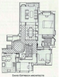
The architectural icons, Palladio, Soane, Adam and Boulee, all master builders, have set precedent in this field. They managed to transcend a visual experience into an emotive one, from 2D and 3D into 4D, an ineffable dimension. When the participant walks through any of their rooms, they “feel” good about themselves, as though these spaces were living entities imparting good wishes. In effect, they are transformative. Like a great poem or painting, the visual aspect is merely the first point of impact. So, too, with spaces that “flow.” (sic) Similar to the bespoke suit that seems (no pun intended) to be perfectly poised upon the body, well-composed plans achieve the same effect: they feel natural, as though they have always existed in time, with a sense of history preserved. David Estreich of David Estreich Architects has created some incredible plans that give the owner/renter that comfortable feeling as “always having been.” The spaces move in ingenious ways, providing a flow that is both welcoming and rational. How do we know they make sense? Because they work both on paper and in person. It is an elegant, magisterial feel.
On the other side of the equation is how to parlay this well designed plan into action. This is a most difficult task because unless the end-user can physically traverse the space, they oftentimes don’t understand what it will “feel” like. They won’t grasp the “flow.” In his understanding of the buying process, Matthew Doetsch of 3DPlans.com has developed a means of translating the 4D back to the 3-Dimensional. Through his thorough understanding of the buying process, Matt looked for a better way to show prospects the value of an apartment, even prior to its physical existence. His clever invention of a state-of- the-art selling tool, creating photo-realistic 3D floor plans, makes it easily comprehensible to the viewer and the selling process much easier. Here, each 30 floor plan is designed to resemble an actual unit. In addition, flooring, kitchens, windows and finishes are replicated to the existing or proposed site finishes. This level of detail allows prospects to make effective purchasing and rental decisions. The participant can now get a better feeling for how large the kitchen is, how to determine furniture arrangement, window treatments, etc.
So, in joining the East to the West, by implementing great design to effective translation, the prospective tenant/owner gets the best of both worlds. (Part II will deal with more specific applications to both “flow” and “feel,” yin and yang.)

*Note – Article adapted from print. Images reflect reduced quality.
Click here to view original print article.
____
Like this post?
Subscribe to our newsletter for more design tips, tricks and insights!

