Looking Up: The Lost Art of Ceiling Decoration
“Eye on Design” Archive from Mann Report (Article By Gail Green)

Angelo Dongia, the famous interior designer, referred to the ceiling as the most ignored, but interesting, of thesix planes. Fortunately, it hasn’t always been that way. Michelangelo and his patrons didn’t exactly perceive it as such. All the great architects through centuries past have ‘looked up’ and found an interesting surface to adorn. It seems that with the advent of the hi-rise apartment and its lowered top, the ceiling has seen better days. Not to despair. With all of the other five surfaces well explored, the design/decoration of the ceiling has much left to offer the design professional and enthusiast.
There are several options in considering the design and decoration of this sixth surface. It can be painted, carved, plastered, upholstered, covered with glass, covered with metal, wallpapered, tiles, beamed, mirrored, leathered, trussed and any combination thereof. The purpose behind its decoration is both aesthetic and/or functional. Thus, aesthetically it can be pleasing to the eye, while functionally, it can house lighting, define space, and carve out great sculptural shapes (i.e. skylights, domes, etc.). For those optimistic, spiritually minded, the ceiling is a refuge of delight that both enhances and embraces the space at large. Let us consider some of these applications to see how successfully the ceiling can accomplish its art.
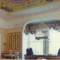
Perhaps the most obvious application is that of painting the ceiling. But even within this genre, there exists a multitude of choices. Certainly, the early painters like Michelangelo used the ceiling to express the zeitgeist, the spirit of the times incorporating religious and political motifs into majestic murals. But apart from these magnanimous pontifications, which predominated ceiling painting up until the 18th Century, the ceiling has recently been painted in a number of ways. Faux paint such as straiae, trompe l’oeil, abstract motifs, silver or gold leafing, and just plain paint (in perhaps a different color) represent just a sampling.
Another early technique, which has survived the centuries, but not now as predominant, is that of the plastered ceiling. Very common in castles, estates and homes for the wealthy is the highly decorative, plaster pattern. Seen mostly in university clubs and bastions of elitism, plasterwork is expensive and conveys a message of importance to the room. Allied to this technique, is the application of woodwork, that sometimes looks like plaster but is actually wood painted over. In its more obvious rendition, is the wood coffer, creating patterns of three-dimensional relief upon the ceiling. This is a more masculine, library look found for the most part in studies, dens, and libraries.
More recently, the ceiling has been adorned with wallpaper or fabric (which includes leather). Not only wise for sound insulation, this use can provide an interesting, warmer aspect to the environment. Some designers even tent the fabric, gathering it at the top as to suggest an Eastern, Oriental feel. Mirrors have been used on the ceiling as well, but mostly in bachelor pads and discos. Its counterpart, glass is used in more functional ways, admitting light and creating a halo-like aura. Skylights, as they are commonly referred to, enlighten and add to the breath of the room in which they are situated.
The use of stone or ceramic tiles on the ceiling has also become rather common. Here, we find it most regularly used in bathrooms and spas, where the stone can accommodate the moisture build-up. It can be most pleasing to the eye by creating a continuous look throughout on all six walls. Metal, whether in tile or sheet form, is also used on the ceiling. This material can be painted or lacquered to protect the finish, or left raw to oxidize, depending on the desired look. And even, shells, leaves, horn, and bits and pieces of different materials together have appeared on the ceiling to create and express the owner’s personality.
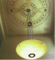
On the more architectural side of ceiling design is the carved dome, dropped surface, beamed structure and opened space all serving a specific yet aesthetic function. For instance, by carving out a section of the ceiling in the shape of a circle, square, oval, etc., the designer actually defines the space below. As in the picture illustrated, the sculpted ceiling gives that designated space definition; it makes it special. It lets you know that it is a space unto itself; it’s not just walk-through circulation. The modern beamed ceiling accomplishes the same thing; only it’s more architectural in feeling. It draws lines in the air, overhead, telling you where and what your limits are spatially. In addition, by creating coves or dropped beams at the ceiling, lighting can be housed and wires concealed. Cove lighting combined with some ceiling sculpture can create very interesting, atmospheric effects. Functionally, through the use of dropped soffits and beams, the ceiling can house all types of electrical and audio wiring, air conditioning ducts, vents, recessed down lights, and speakers to name a few.
The “Ceiling” has resurfaced. In recognizing both its aesthetic and functional capabilities, the designer now sees the potential of this forgotten surface and the advantages of “Looking Up.”


*Note – Article adapted from print. Images reflect reduced quality.
Click here to view original print article.
____
Like this post?
Subscribe to our newsletter for more design tips, tricks and insights!

