Black and White: Day and Night
“Eye on Design” Archive from Mann Report (Article By Gail Green)

While modern sensibility gravitates towards the neutrals of beige and beige, we seem to have forgotten the neutrals of “the lost generation:” black and white. Gertrude Stein may have had other colors in mind in coining the phrase, but it recalls her zeitgeist and the Cole Porter era. With the burgeoning of photography, images were cast in black and white, suggesting the complexity and uncertainty of the Great War, while alluding to the security of a black and white world. These were the neutrals of that time: black and white. And, of course, we know, that when thrown together, they are anything but. The product of their marriage is color, the grays of reality. Yet, their purity transcends that ambiguity. There is something very refreshing about black and white. You know where you stand. Black tie or white, the event is formal. The little black dress iconically worn with white pearls is as symbolic as Coco Chanel’s love of combining the contrastingly stark opposites. It is Fred Astaire and Ginger Rogers; it is the world of Man Ray and Moholy-Nagy. It is Modernist with roots back to Josef Hoffmann’s passion for opposites. It is starchy and sharp, transparent and clean. It is Ford’s Black car with white-walled tires. It is “Night and Day, Day and Night.”
It is comforting to know that we can return to these neutrals in design-that they present themselves as sharp an image as before, making black and white classic. Always a strong statement, they let the homeowner know exactly where they stand. And, stand they do. As walls, furniture, glass, lights, and in almost every aspect of the home, they carve their niches, making a gesture to the past, yet very modern.
Black and white is effective in making bold statements. These neutrals define functions easily, while creating sharp edges of distinction. For instance, a black sink against a white wall, or visa versa, clarifies for the user a definiteness of purpose. Or a black couch set upon a white floor creates the same strong backdrop. It is dramatic, theatre in the home.
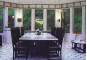
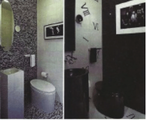
Using black and white tiles on the floor, whether marble or ceramic, creates this sense of drama especially in an entry foyer. White tiles placed on a diagonal with black inserts is the quintessential classic, classy floor. Placed as such, it leads the visitor gracefully through the entry, suggesting a sense of purpose and style. In the bathroom, in particular, the powder room, black and white parlays an air of formality, suitable to the half-bath. The more recent water closet by Kohler, the Hatbox, adds to this sense of bathroom drama, both in its shape and color. Its sculptural form, that of a ladies’ hatbox, disguises its true purpose, suggesting perhaps that it transcends its ordinary function. It is elite and elegant, functional and fancy.
Furnishings also create home drama. Black floors are classy, so much so, that when a white couch or rug is set upon it, a special tension is created. It says, in effect, that it knows what it is and what it wants to be. It presents an aesthetic level of comfort. White these neutrals feel perfectly at home in the more public areas, in the more private ones, they are less so. A bit startling in the bedroom, they are sharp to the eye. If one wishes to use black and white in the private areas, the neutrals need to be somewhat tamed. For instance, a mostly white bedroom with splashes of black will fit the bill. It will create a light, bright, airy space that is very chic and modern. Alternatively, a mostly black room will absorb all the light, making for a smaller, cozier space, more appropriate for a man’s study.
In the kitchen, black and white is especially effective as it creates a crisp backdrop to the meals prepared there. White cabinets with black counters and backsplash draw a sharp distinction of purpose, which highlight the appliances and cooking utensils. In particular, stark white walls in a kitchen parlay an image of cleanliness.
Whether in the entry foyer or bathroom, black and white create a sense of drama in the home. The contrasts of its opposites make for a formal, yet elegant and classy backdrop, suitable for those who want a classic look of appeal.


