Close Your Eyes. Now Open Them. What do you See?
[Photo: David Estreich]
OK – Let’s Get to the Point: The Destination Point
You enter a room, and what’s the first thing your eye naturally lands on? An elegant table? A rustic fireplace? A set of overstuffed armchairs? A particularly vivid accent wall? All of these are what’s referred to as interior destination points – spatial anchors that create strong visual draws and evoke the room’s statement as a whole. Without a destination point, a room might look unfinished or lopsided, because there is nothing holding it together as a cohesive space
Now that you have a preview of what destination points are about, we are going to briefly touch upon the following:
- The importance of destination points
- Three strong examples of destination points (with input from our guest experts!)
- Getting lucky with “natural” focal points
- Three quick tips for creating your own destination points
- How to get a bit more creative with destination points
- What you should not do
- A parting challenge for you
[note that the focus of this article is on “interior” destination points, which we will simply refer to as destination points to make things easier]
Why Are Destination Points Important in Interior Design?
For starters, a destination point functions as an initial point of visual contact for someone when he or she enters a room. When you look directly into a room, the first thing you see is what informs the space; like a wall defines the physical confines of a room, the destination point defines the aura of the area. You might see some of the furnishings or accessories that go into the room, but you need a space that creates an impression both the first and last times you see it.
Three Strong Examples of Destination Points
In my experience, three particularly effective destination points are artwork, niches, and backsplashes.
ARTWORK
[Photo: Phillip Ennis]
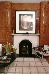
Bold works of art are excellent for making a strong statement. This is apparent in the above image which features a tulip print photograph over a fireplace. The picture’s positioning serves a twofold purpose: first, because it is positioned a bit above eye level, we have a place for the eye to naturally fall when a person enters the room. Second, the photograph pulls in the eye and all peripheral imagery, creating an intriguing composition of its own—after landing on the photograph, one will visually cull the fireplace, the chairs, rug, and all other surrounding elements. Below are more examples from our guest expert!
“I always believe that artwork has the ability transport the viewer to another space without ever leaving the room,” says Lisa Cooper, owner of the New York City-based gallery Elisa Contemporary Art. “Canadian Artist, Marie Danielle Leblanc takes notes and photos during her travels around the world. Her abstracted landscapes—filled with saturated color and movement and undulations where she drips and drops the paint—invite the viewers to travel to and get lost in these worlds.”
[Photo courtesy: Elisa Contemporary Art]
[Photo courtesy: Elisa Contemporary Art]
Artist: Marie Danielle Leblanc; Title: Woolloomooloo Bay
Medium:Mixed Media on Wood Panel; Dimension: 48×72
NICHES
[Photo: David Estreich]
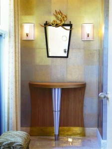
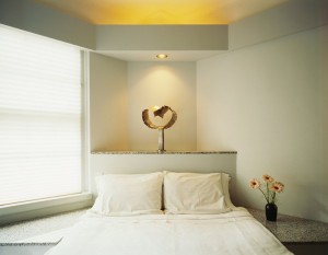
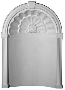
While indeed a focal point, the niche is hardly limited in its imaginative appeal. It is a destination mark, more like a whirlpool, than a dead-end. Here, the architect / designer creates whirling, cupholds of space, suitable for a work of art. Though usually made of plaster and unmovable, the architectural niche is fluid in design and imagination. Niches beautify and enhance a wall by articulating a space upon which the eye can both rest and delight. Though one may feel compelled to fill it with a vase of flowers or a statue of some kind, this cared recess still strikes a strong pose when left empty. Usually set into a wall, it is a carving into space as opposed to a relief embellishment. It is a lead in, into a unique and highly individualistic unexpected area.
While most think of the niche as being curved, the modern niche has its own linear profile. Straight, square, and rectangular shapes are not uncommon. In addition, niches enlarge a room by creating perspective in an almost false sense of depth. Though there is a physical depth, it is sometimes so slight as to almost be on the same plane as the wall. Yet one senses that depth as the eye tends to move comfortably within its center.
“Niches are a means by which one may playfully break the plane of a wall in order to call attention to the objects within and the space without,” says Bethany C. Baldwin of Hyde Park Mouldings, Inc. “A niche is an invitation to pause and appreciate that which one values.”
[Photo courtesy: Hyde Park Mouldings, Inc.]
BACKSPLASHES
[Photo: David Estreich]
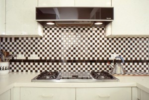
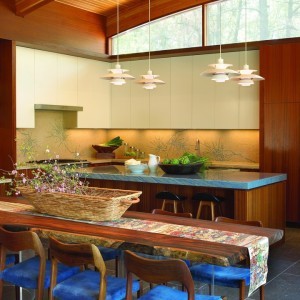
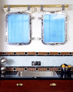
As a small part of the entire kitchen (or kitchen area), the backsplash has enormous visual impact. This rather narrow strip of surface is situated at about eye level, where the observer’s visual orientation is set, and what surrounds this strip is a generally consistent stream of kitchen cabinets, usually of the same color and style. So we have a striking contrast between the cabinetry and what lies above and below it: the backsplash. Like the niche, a backsplash can, if properly designed and configured, draw the eye and create a very strong destination area. Backsplashes are among the first things you notice when entering a kitchen, and they will either make or break the impact of the space. Almost any material—marble, granite, glass, wallpaper, mirror, wood, paint—used in the correct way, both proportionally and aesthetically, will have the impact for which you are aiming.
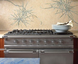
“The back-splash in a kitchen potentially communicates far more atmosphere per inch than any other element, including the cabinets, the appliances, the counters, the floor or the ceiling. The only ingredients in a kitchen that have a greater power to transform the ambiance are the chefs, the guests, and the cooking!” says Sara Baldwin, founder and creative director of New Ravenna. “It can be a daunting task, choosing a backsplash. It took me two years to choose mine. I finally settled on a Japanese woodcut-inspired pine-needle mosaic which perfectly ties the exterior with the interior while referencing my childhood love of loblollies.”
[Photo courtesy: New Ravenna]
Ikebana, a natural stone hand cut mosaic shown in Lagos Gold (h), Verde Luna, Travertine Noce and Topaz Onyx (p), designed by James Duncan for New Ravenna.
[Photo courtesy: New Ravenna]
Ikebana, a natural stone hand cut mosaic shown in Lagos Gold (h), Verde Luna, Travertine Noce and Topaz Onyx (p), designed by James Duncan for New Ravenna.
Striking Gold: If You’re Lucky, You May Have a “Natural” Focal Point
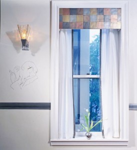
Natural Focal Points are essentially pre-existing destination points, such as windows, fireplaces, entry foyers, or other architectural features that naturally present a point of interest.
By themselves, these features lend a sense of definition to the room in terms of physical space. With a little enhancement, however, you can make these features the focus of the room and have them define how the space feels. With a fireplace, for instance, you can put a fresh coat of paint on the brick, replace the surrounding stone with a different material, or use the mantle to draw the eye above the hearth. Windows can be redesigned with elegant treatments that say “Look at me, I’m beautiful and important,” even if those windows don’t offer spectacular views or vistas.
[Photo: David Estreich]
Curious How The Professionals Leverage these Natural Focus Points?
When working with spaces that already have architectural features in them, professionals know the importance of starting with natural focus points as the foundation for the room, and to then construct the space around them. As designers work both on paper and with the confines of the space in front of them, it is important to take all aspects of the room—as it looks in the present and as it will look in the future—into consideration during the planning phase. That means determining if there is a preexisting destination point, and if it makes sense to carry that point over into the new design, or if the room would be better off by constructing a new destination point. The critical elements here are the overall sense of harmony and an understanding of how the eye naturally falls upon the space.
Three Quick and Reliable Tips for Creating Your Own Destination Points
Creating your own destination points takes time and an understanding of how the space flows—each space is different, but here are a few general tips for making strong visual anchors:
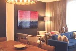
1. To construct a strong optical draw, it helps to figure out where the eye naturally falls. If you are drawn to a particular wall of a room, for example, try painting it a bold or arresting color that stands out and makes a powerful statement for the space.
2. Furniture can also be used to anchor a space, especially in an overall neutral color scheme. A pale green sectional sofa, for instance, has enough color to draw the eye and serve as a feature around which to visually construct the rest of the space.
3. Window treatments have more power than you may think they do. If you look directly into a room, you may see windows that look out on an unattractive view. You can use elegant window treatments to subtly camouflage the view and enhance the room.
Getting Creative with Destination Points
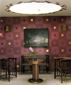
If you’re up for getting a bit crafty, another strategy is to create a focal point by establishing an arrangement of multiple elements (or rather a vignette) instead of using just one point. With a multifaceted composition, your eye simultaneously takes in an entire field of images, as opposed to one major element. Here (see below image), a center tea table, a settee, two chairs, a pair of sconces and a piece of art anchor the eye. Unlike the strength of the central artwork in the first image, where the eye focuses in on one central element, this vignette is composed of weighted elements, with no one constituent outbalancing or outweighing the others.
[Photo: David Estreich]
Now That You Have a Pretty Good Sense of Destination Points, Here’s What You Should Not Do
Don’t Mess Up the Destination Point!
There are some ways you can fail with destination points in terms of creating good circulation, such as using too many destination points. A large room with too many focal points can look unbalanced; the eye won’t know where to settle and the viewer won’t know where to go next. In my experience with larger spaces, it helps to have destination points directly to the right or left at the furthest point. Facing either direction, one should see something of importance for the room to maintain its focus and balance, and lend to the room’s circulation.
A Parting Challenge
This weekend, have a look around your home, see if you can enhance or create one destination point based on the tips in this article.
Then, when you are confident that you have a strong focal point, stand in front of it…
Close Your Eyes. Now Open Them. What do you See?
____
Like this post?
Subscribe to our newsletter for more design tips, tricks and insights


