Tricks Of The Trade: Allusion Or Illusion
“Eye on Design” Archive from Mann Report (Article By Gail Green)

If slight of hand is the magicians force, then slight of imagination is the professional designer’s expertise. What distinguishes the so-called ‘do-it-yourself’ decorator from a real pro is basically the magic they create in sculpting and creating space. No mere pretty pink polka-dots on a wall, but perhaps a floating wall, one which seems to exist in space with no apparent support. Is this magic or professional know-how? It is both one and the same; it is an understanding of how a room can be made to look other than it is, and for a space to be constructed to look as though it’s imperfections were perfectly manicured.
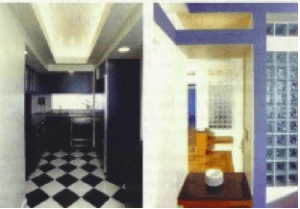
To begin, the narrow passageway is oftentimes an easy problem to solve. The professional knows that by dropping the ceiling, the side walls “seem” to expand it’s breadth, thereby increasing the width of the space. Was the space really widened? Was the neighbor’s apartment encroached upon? Of course not. It is simply a trick of the trade. Another bit of magic in making a floor appear larger than it is, is by tiling or laying the floor on the diagonal, so that it appears that it opens up the space spreading off into some undetermined distance. Put a border around it, the magic is destroyed, the illusion cut short.
When visiting Malmaison outside of Paris last week, I noticed an abundance of antechambers, spaces created to create the expectation of surprise and, if you will, a breathing area, like a stop in music, where one waits in wonder as to what comes next. Often, these antechambers have dropped ceilings so as to create a sense of enclosure while simultaneously making the entering space feel even larger and more majestic. This sculpted drama is sensual in its appeal of the unknown. And then, when the individual passes into the major room, voila, it is grander than thought. It is really a type of physics going on here, as one lessens the feel of one area, the conjoining area is enlarged. Niches do a similar thing; they carve out space, yet make it look larger. They create diversity and a sculpted sense that something lies beyond and within.
Another bit of magic is that created by the half-wall. Instead of building all the way up to the ceiling, and closing off a space, a half or three-quarter wall is created to divide spaces, while maintaining an open, airy feeling. These partial walls, which may be made of glass block, cabinetry, sheet rock, sandblasted glass, metal, basically any material that adds interest and intrigue. It begs the question of what is beyond …. and yet visually it is completely open. This too is magic, as the viewer must now postulate on what lies ahead. Mirrors create magic as well. Basically, they expand space in addition to reflecting light. So, for instance, poised in a narrow hallway, they open up that area at seminal junctures. Also, if cleverly placed, say diagonally across from a window, it opens up the view by reflecting it. In addition, if the wall colors surrounding the mirror are light, this brightness will add to the walls’ reflectivity. Putting mirrors on every wall, including the ceiling will NOT enhance the room, but make it look ridiculous. A true professional knows how to and how not to use mirrors to their advantage.
As to the magic behind furniture placement, common sense dictates. Too many do-it-yourselfers align pieces with the direction of the room, so that a long couch will sit against a long wall, emphasizing the length of the room, instead, along its horizontality. Instead, furniture should be placed against the grain, with the couch/s adjacent to the long wall, creating a more harmonious, balanced effect.
Pocket doors create magic by disappearing into walls and economizing space. They are also very elegant, when outfitted with beautiful hardware. Another trick behind enlarging space is to lay wall-to-wall carpeting down throughout the major connected spaces. This makes the room feel larger and more balanced. In rooms, like the kitchen, employing a soffit, which adds light in a consistent, yet focused stream, gives the illusion of light all around. Like cove lighting, it enlightens and enhances the area.
In terms of drapery, it is typical to assume that they will cover the view. While this may very well be the case, if it is done correctly, they will not. Instead, side panels can actually enhance the view by framing it, as opposed to covering the opening. It may not be obvious to some, but built in cabinetry, when designed correctly, will enlargen a space as well. It becomes recessive and disguised as part of the wall while serving a major storage purpose.
And, finally, the creation of an entry foyer is perhaps the single best aspect of designer magic. By carving out a space, albeit small, it serves as a preface of what is to come. Again, it gives the illusion of grandeur beyond. So as not to enter directly into the living room, it is a transition area for circulation and surprise. What exactly lies beyond this curved wall, or veiled panel?
These are some of the slights of hand, rights of imagination that the professional designer and architect conjure up to create the magic of space.

*Note – Article adapted from print. Images reflect reduced quality.
Click here to view original print article.
____
Like this post?
Subscribe to our newsletter for more design tips, tricks and insights!

