2015 Kips Bay Decorator Show House – Review By Gail Green
Written for Mann Report (By Gail Green)
Transforming a luxury Manhattan home into an elegant exhibition
Each year, celebrated interior designers transform a luxury Manhattan home into an elegant exhibition of fine furnishings, art and technology. This all began in 1973 when several dedicated supporters of the Kips Bay Boys and Girls Club launched the Kips Bay Decorator Show House to raise critical funds for much needed after school and enrichment programs for New York City children. Over the course of four decades, this project has grown into a must-see event for thousands of design enthusiasts and is renowned for sparking interior design trends throughout the world.
In terms of style and trends, eclectic is the key word
From traditional to modern and everything in between, there is a favorite room for everyone attending the show. Shades of red, dark or bold, seems to be a strong show stopper: every room on the second floor evidenced some of the color from Alessandra Branca’s “Salon Rouge” sitting room to Mark Sike’s gingham dining room to Jamie Drake’s deep burgundy walls.
A swirl of a swerve in both design and art
Three rooms, in particular, stood out for their 21st Century appeal. The first is that by Ron Bricke. Moved by the swirl of a swerve in both design and art, Bricke created a foyer space that was smart and chic. He brought together elements that captured the “near-perfect curve and counter-curve of the ground floor hall, staircase and balcony. As Bricke notes, “it was intriguing to rediscover the impact of the curve in a mural, a sculpture, artwork, objects and even upon the staircase carpeting. This sensuality (both male and female) is accentuated against two different and powerful backgrounds. The first, that of the all white and, the second, that of the Pitch Black and rust colored steel, strike a bold, contemporary balancing force.” Indeed, the sensuous line is carried through and up to the second floor by his wonderfully faux painted modernist mural – so subtle, yet poignant.
[Credit to Michael L. Hill] [Credit to Michael L. Hill]
A veritable homage to the painter cum graffiti artist, Keith Haring
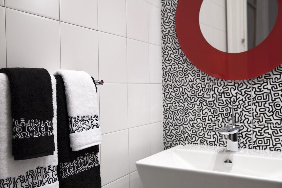
Bricke’s modernist mural is a perfect lead in to Gail Green’s “An Artful Loo,” a veritable homage to the painter cum graffiti artist, Keith Haring. Attracted to the visual beauty and explicit message of the Haring tiles, produced by Ascot and carried by Hastings Tile & Bath, Green creating a powder room that is both bold and graphic. The tiles anthropomorphic-like theme is sharp and chic, graphic and poignant. With different shapes on the tiles visually blending into each other like mazes, they are hardly distinguishable, yet decipherable. At a distance, they form a pattern; up close, they tell a story. Admiring Haring’s fanciful labyrinth of connections, Green appreciates how Haring weaves a serious idea into pure play. The floor and front wall tiles create a balanced counterpoint to the stark white tiles on either side. Running around the perimeter of the room is a border tile suggesting another Haring motif. The newly introduced, starkly modern and stunning, Kohler Veil water closet is a perfect complement to the tile’s geometry. It is a subtle reference to the observer needing to look closer, beyond the obvious and to the symbolic, to a masked veneer. Is there something more to this WC? Leron’s lyrical linens mime the border’s dancing figures, combing form and function into beautiful pieces of artistry. Rounding off the circle imagery is Mod Mirror’s back-painted piece that fits thematically and contextually right into Haring’s forms. Are we the observer or the observed? The fanciful light fixtures, one by Leucos that plays on the idea of fluidity and stream of unconscious and the other by Ingo Maurer that suggests the bird-like flights of imaginative fancy, extend to the surreal, marrying wit to whimsy. Lastly, Wendy Mark’s striking, yet moody, red portrayals of the unnerving subconscious speak directly to Haring’s archetypal imagery. In effect, it is as though both artists are in dialogue about, as Wendy says “the emotional impact of color, where red can read as a passion but may also be disturbing and dark.” Indeed, Haring’s images, full of monsters and scary beings, parlay a like-minded theme.
[Credit to Lucea Spinelli Photography] [Credit to Lucea Spinelli Photography]
Midnight Manhattan Lounge – a room to spend a wonderful evening
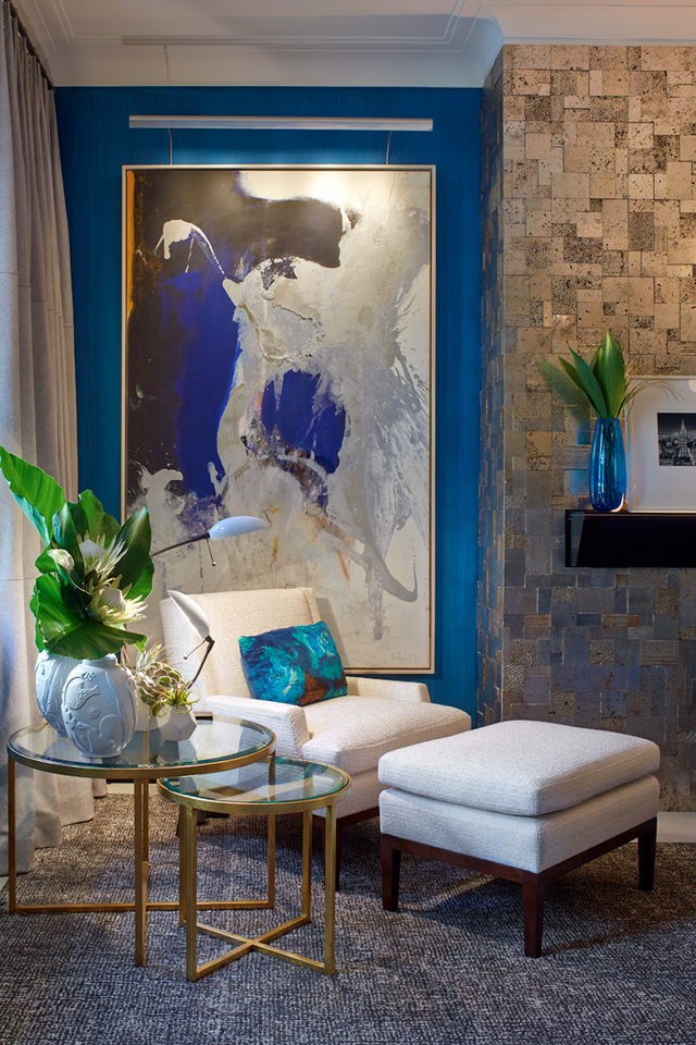
Staying in the 21st Century is Pavarini Designs’ “Midnight Manhattan Lounge,” a room in which one would want to spend a wonderful evening. Their room exhibits a collection of artisanal fixtures from the 20th and 21st century. Complete with dry-bar and luxurious full bath, the room continues the sensuous theme explored throughout the house with the display of lapis and a chocolate and crème colored rich palate. Here, the focus is on form and function. Who wouldn’t enjoy an evening in such an elegant haven of relaxation and serenity? As Pavarini notes, “We created a delicate balance of deep wood finishes and custom millwork, patterned leather, lush carpeting, and a curated collection of hand-made pieces of lighting and furniture. The scheme embodies the synergy of my philosophy: an expression of expressed drama through restraint with particular focus on asymmetry and the creative use of tile.” Pavarini’s use of a highly sophisticated lighting system, complete with iPad dimming and state of the art lighting products creates some striking effects.
[Credit to Phillip Ennis]
[Credit to Phillip Ennis]
Final Thoughts: a perfect confluence of past and present
A must-see show, this year’s Kips Bay Decorator Show House illustrates the zeitgeist of our time: a perfect confluence of past and present.
Click here to view original article
____
Like this post?
Subscribe to our newsletter for more design tips, tricks and insights


