Color Me…Not So Subtle, or How Color Becomes Design
“Eye on Design” Archive from Mann Report (Article By Gail Green)

Back in the fifties, there were avocado greens and mustard yellows. With the sixties came oranges and browns. The seventies heralded in psychedelic tones of any color. And the eighties ushered in white. Neutrals became the color palette of the nineties. And now, as Cole Porter suggests in speaking of love, ‘anything goes.’
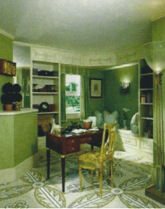
The important thing about color is not the color per se, but rather how it is used. No mean slab of plain paint on the wall, color is applied in many interesting architectural and decorative ways. So, paint can be divided into basically two categories: solid colors used in sculpturally interesting ways, and the decorative faux techniques.
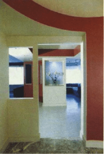
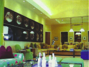
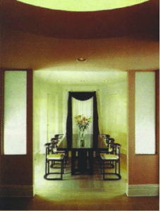
In its plain paint architectural usage, color is applied to beams, columns, ceilings, walls, or any distinct structural element. This application can tend towards the dramatic in its sculptural outlines. For instance, applied to a flying beam, it delineates the surrounding space. On the ceiling, a strongly colored paint adds surprise and interest. Firstly, it brings a high ceiling down to a more humanistic level. But more importantly, when strongly painted, the ceiling becomes a vital decorative element relating well to the walls, floor, and furniture below. In addition, when a room contains many eaves and ceiling angles, painting ‘out’ the ceiling from the point of where the eaves start leaves the architecture intact but eliminates the confusion of all the breaks. Another subtle and effective technique in the painting of walls is stressing the horizontal elements on the same plane; that is, by painting all of the horizontal or vertical architectural elements of a space the same color creates an interesting continuity throughout.
One of the more interesting color palettes is the historical color selection by Benjamin Moore. When used effectively, these colors blend in harmoniously with the architecture and furnishings. One or more used together create an even greater drama.
In terms of decorative faux techniques, there are many alternatives. Straiae, cross-hatching, sponging, ragging, combing are just a few of the subtleties of color combined with brush stroke movement. A very popular approach is that of Venetian stucco. Nor only does this technique add three-dimensionality to the room, it is both beautiful and functional. While composed of plaster and paint, the wax finish makes it easy to clean and maintain. Through the use of a successful color palace and application, color makes a room come alive. When used well, it becomes the focal point for both decoration and architecture, enhancing and creating drama in its path.
*Note – Article adapted from print. Images reflect reduced quality.
Click here to view original print article.
____
Like this post?
Subscribe to our newsletter for more design tips, tricks and insights!